Last week we put the spotlight on the pastels that made Pantone’s colors of the year. This week, we’re going bold.
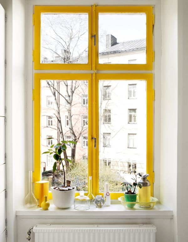
The beauty of Freesia is that it doesn’t take a lot to make a big impression. Use it on your trim and you’ll swear the sun is peeking through your window.
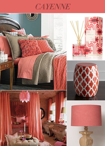
Less aggressive than red, more mature than pink. Cayenne makes a bold statement without being pushy about it. We love it.
Celosia Orange – A Burst of Bold
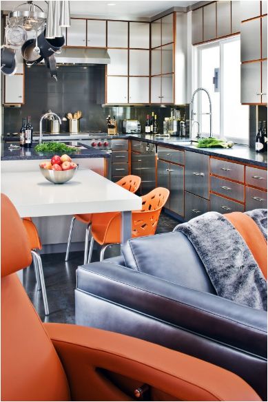
We’ve got a thing for orange. It pops. It’s full of energy. And dang if it doesn’t look good. And while we wouldn’t go painting every wall with it, it looks great when used as an accent color.
Radiant Orchid- A Splash of Color
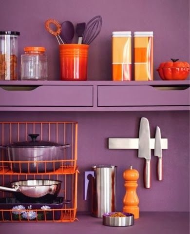
As good as Radiant Orchid looks on this backsplash, it’s no wonder purple is the color of royalty.
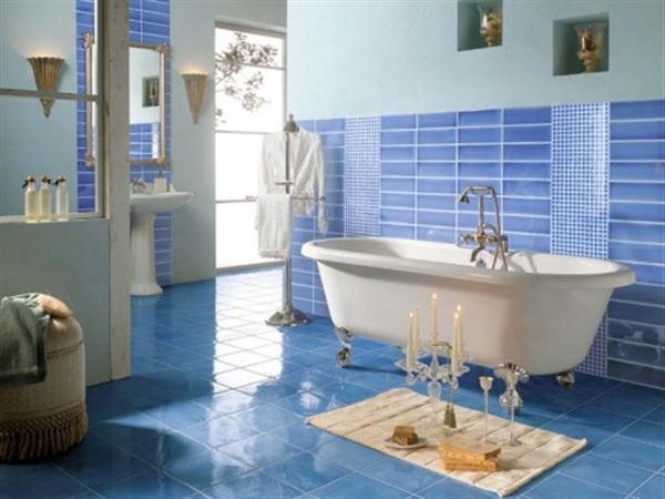
There are few colors that are always in vogue. We think Dazzling Blue proves that point perfectly.