Ready to freshen up your home? Here are five fantastic ways to incorporate Pantone’s colors of the year into your design and décor.

Whether it’s Placid Blue paint or wallpaper, one look and you’ll be relaxed. And while it’s classy in its own right, we think the gold accents are a fantastic touch.
Violet Tulip – What Relaxation Looks Like
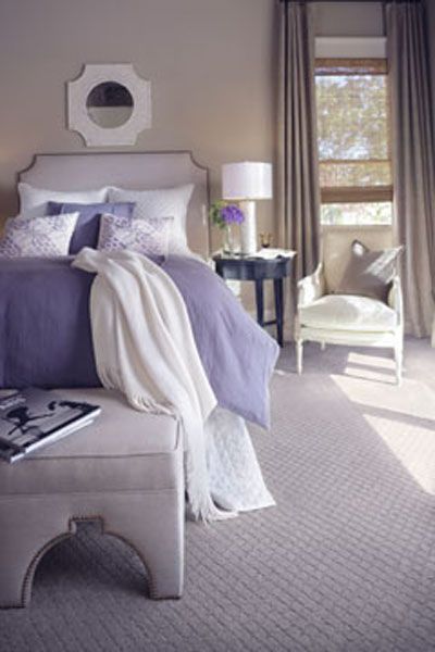
If we were to describe this room in one word, we’d go with “ahh.” Violet Tulip is proof that the world needs more lavender in it.
Hemlock – A Little Goes a Long Way
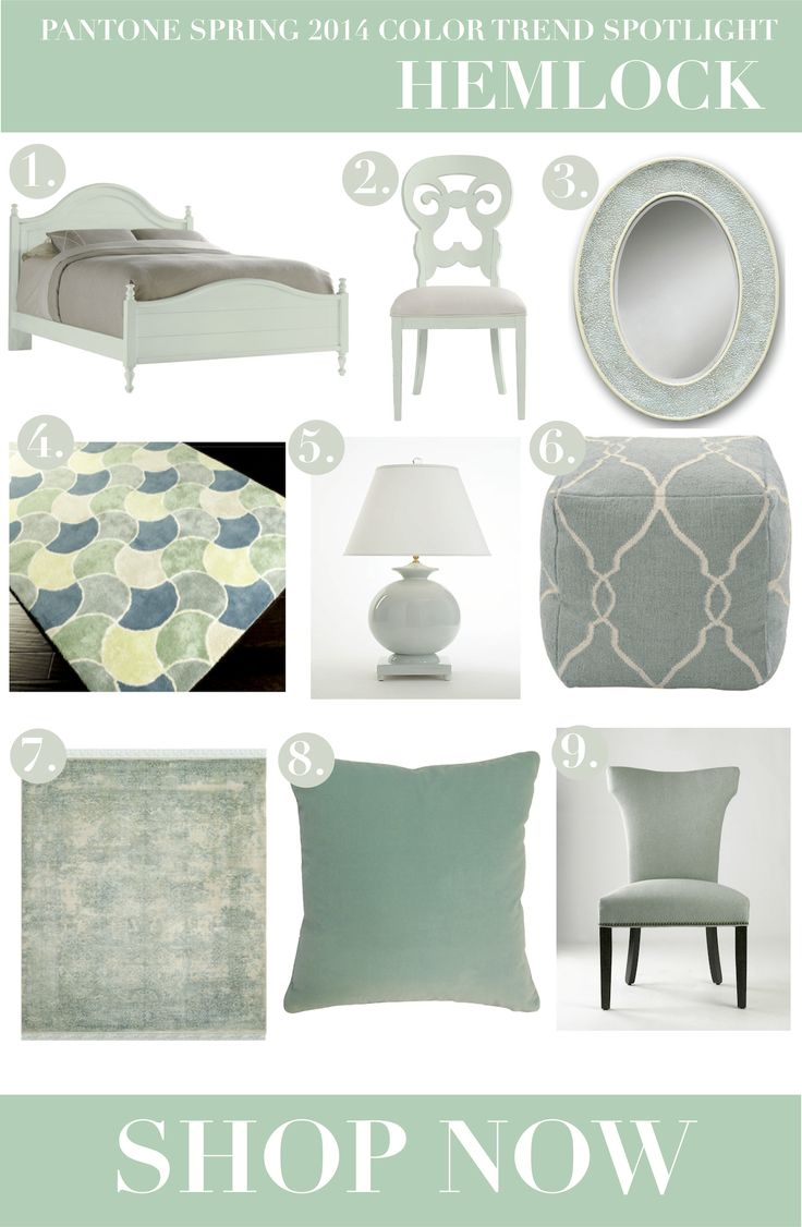
Despite the fact that it’s anything but bold, too much Hemlock could get a tad overwhelming. Good thing it’s perfect as an accent color.
It might be grey but all we see is platinum. Beautiful, luxurious, platinum. And as we all know, platinum makes anything look fabulous.
Soothing. Unassuming. Light, yet relaxing. Sand is the color that was made for bright rooms. One look and it’s easy to picture yourself sipping a cup of tea and then drifting off into a blissful afternoon nap.
That picture certainly does prove the world needs more lavender in it!